As you may know, last year SCALE formed a diversity committee which was announced in December 2015. In that announcement I said the first thing we wanted to do was to collect, analyze and publish some data. Today, I give you that data. (Sorry for the delay - while this was originally written in May 2016, changes in SCALE staffing this year lead to a lot of additional work which delayed the lengthy edit and review process for this).
To be clear, we are establishing a baseline to work from - no changes in approach, outreach, or process were implemented.
Analyzing data is tricky. It's easy to try to show the thing you want with charts and graphs, so in an effort to be as fair as possible, I've tried to cut the data in as many ways as possible. I am not a statistician, so if there's something I should do better, please let me know and I'll try to accommodate.
Diversity cuts across many lines: gender, sexual preference, race, background, ethnicity, etc. I'd love to have a look at diversity in all ways, but we have to start somewhere, and this year we’re analyzing our data against gender.
CFP Process
We're going to start with our CFP process. Here is the data SCALE collects during the CFP process:
- Gender (optional)
- Age (optional)
- Name
- Company (optional)
It's worth noting that in the CFP review process we cannot see people's answers to diversity questions. However, at the moment, names are visible. Since names don't always align with the way people identify, only the optional demographic data people chose to submit was used for this analysis.
Questions
For this analysis, SCALE was interested in finding out:
- Does the SCALE CFP system show an inherent bias against women?
- How does the number of submissions from female speakers compare to the industry?
Unfortunately, no other technical conference publish numbers as far as we know, but hopefully this can help change that.
The Data
Let’s start off with the most naive approach:
- Look at every submission broken down by gender
- Look at every accepted talk broken down by gender
NOTE: You can group bars one of two ways - either by gender, or by the before/after we're comparing. Depending on who you are one may be easier to read than the other, so for every graph, we generated both.
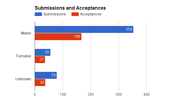
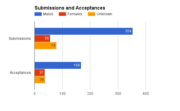
Again, these two graphs are the exact same data - the bars are just grouped differently.
What we see here is that while the number of submissions from men dwarf the number of submissions from women and those who didn't specify a gender combined, the difference in accepted talks is much smaller. But it's actually harder to see this with raw numbers, so let’s look at percentages next.
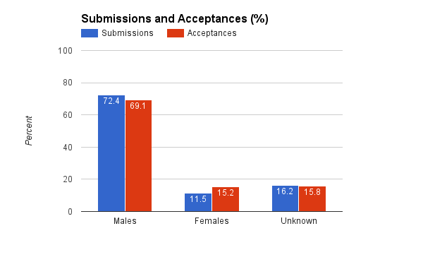
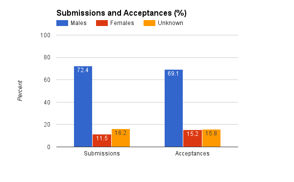
The take away here is that despite the fact that only 15% of accepted talks were from women, that is higher than the percent of proposals we got from women (11%).
These numbers can be misleading if individual men or women tend to submit more unique proposals, for example. So let's break it down by unique submitters. Regardless of how many proposals someone submitted, the individual submitter is only counted once - either they got a talk accepted or they didn't.
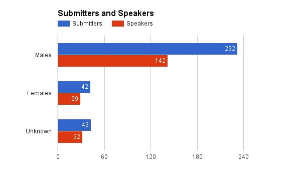
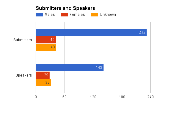
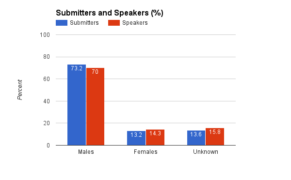
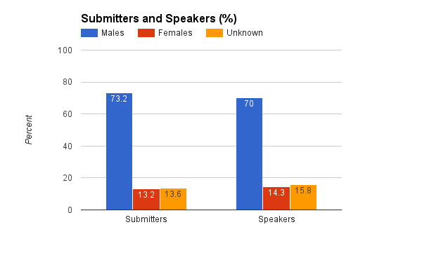
So once again, we have raw numbers first, and percent second. Each pair of graphs is the same data, just grouped differently.
While only 13.2% of our submitters were female, 14.3% of speakers were female. The numbers are very close, so barring entropy, this data does not signal bias towards any reported gender identity.
An interesting metric is the delta between these. In other words, at what rate does each gender get talks accepted?
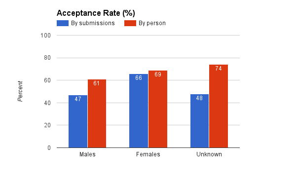
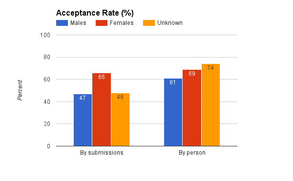
This isn't a way we'd originally thought to cut the data, but in hindsight it's obvious and useful. It's also one of my favorite graphs here. This analysis finds no gender-bias in the CFP process.
Analysis
Cutting the data as many ways as we can think of, there seems to be no negative bias against women in the CFP system. That’s a good start. We obviously have far fewer women coming into the system than men. With fewer women than men in tech overall, there's no surprise here, but it'd still be useful to understand these numbers in some sort of context. Ideally, we'd compare to other similar tech conferences, but as I mentioned that's not yet possible. So the closest comparison I can think of is to tech company diversity numbers. Many large tech companies have recently published their diversity stats.
It is my unsubstantiated guess that there are less women at your average tech conference than at your average big tech company. This is purely based on the fact that tech conferences have generally been an extra hostile environment for women, where as companies - which range in quality here - at least have an HR department. Plus, people need jobs, they don't need to go to conferences. For that reason I'd expect conferences to be behind big companies on the "pipeline problem."
In June 2015, Facebook reported 16% women in "tech" roles, up from 15 the previous year. Google reports 18% women in tech in 2015, but doesn't keep historical data online. Apple doesn't, as far as I can tell, split out their status for tech and non-tech jobs. Yahoo reports 15% women in tech as of 2014. Twitter reports 13% women in tech for 2015 up from 10% in 2014. Atlassian reports a very high 21% women in “software” for 2015 but doesn’t keep historical data online.
OK, so for 2015 we have 13% - 21% among some of the large US tech companies - that’s a mean and median of roughly 16%. SCALE weighs in at about 14% of speakers identifying as women, or about 15% of accepted talks coming from women. So we're roughly in the middle of the range of some of the big US tech companies by that measure.
However, there's this whole "no response" category. What is that? Well, that's people who didn't fill out the optional demographic information. Some of these people chose not to for whatever reason, others may not have known it was there (we made it more prominent about half way through the CFP). So why would they chose not to do it? Some may not clearly identify with a specific gender. Others many not have believed that the demographic information really would be hidden from reviewers (it is). And of course there can be other reasons.
From many discussions I’ve had with underrepresented minorities at conferences over the year, I’ve been told that they are less likely to report optional demographic information in a process like this, since they are the ones more likely to be discriminated against or called out. So while I did the general analysis only on the optional demographic information, I also did a pass where I walked through the missing demographic data and filled it in based on the name. This is, obviously, imperfect. While none of the names were particularly ambiguous, that doesn't necessarily mean all those people identify as the gender their name implies. Nonetheless, it's another piece of data.
So here's what I found when I did that. The number of proposals from women went up to 13.3% (from 11.5%) and the number of accepted talks from women went up to 18.1% (from 15.2%). If we look at unique people instead, women who submitted talks went up to 15.1% (from 13.2%) and the number of female speakers went up to 17.2% (up from 14.3%).
I'm not building graphs based on this data since it may misrepresent some people... but I cut the numbers to see how much of a difference it makes, and it appears to be non-trivial.
Attendees
So let's look at attendees. This is much simpler. Demographic data here has an extra option ("other"). While “other” is an option in the CFP, it was not chosen by any speakers in 2015.
The Data
Here's the data for this year. Only one graph.
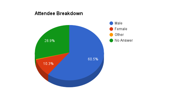
By the reported numbers, we have 10.3% female attendees, 0.4% other, and 28.9% no answer. Unfortunately, the percent of female attendees is lower than the rate of accepted talks from women.
We don’t have the data, but in future, we would like to cut this data by badge type as well.
Conclusions
I had no idea what to expect when I sat down to slice this numbers. In the CFP side, it’s encouraging to see the data not showing a gender-based bias. However, unsurprisingly the data also shows we have a long way to go. 15% of our speakers being women is not enough. It's 35% too few! It's not going to change overnight, but we need to keep vigilant. We all have a part to play. Whether that's calling out someone for being sexist or racist, or whether that's reporting numbers to measure progress, or whether that's encouraging more women and other minorities to participate and helping to make tech an awesome place for everyone.
I'm sad that the percent of female attendees is much lower than for speakers. I reached out to several women at the conference this year and spoke to them about their experience, and received almost entirely positive feedback. The only request for improvement we received was to make our code of conduct easier to find on the website - which has been remedied (it’s linked it from the footer of every page).
Our next step is to meet as a committee and understand how best to move these needles. As a reminder, we have not yet taken any steps to change this data - this was step 1: measure what we have. We have many ideas to discuss on improving both the CFP and attendee experience as well as gathering better data. We’d also love to hear any ideas from the community (email me at phil at socallinuxexpo.org). We will report back with specific steps we plan to take.
As I said in my original post, good data is critical. I invite all our fellow conferences in this space to join us in publish their data so we can get a better picture of where we are and where to devote our resources to improving things the most.
The SCALE Diversity Committee would like to sincerely thank everyone who did provide demographic information for this exercise and especially to everyone who helps make SCALE a positive and inclusive place. It's a great community that we're proud to be serving.
Finally I’d like to thank the entire Diversity Committee as well as bethanye Blount and Naomi Reeves for their invaluable help in preparing this post.